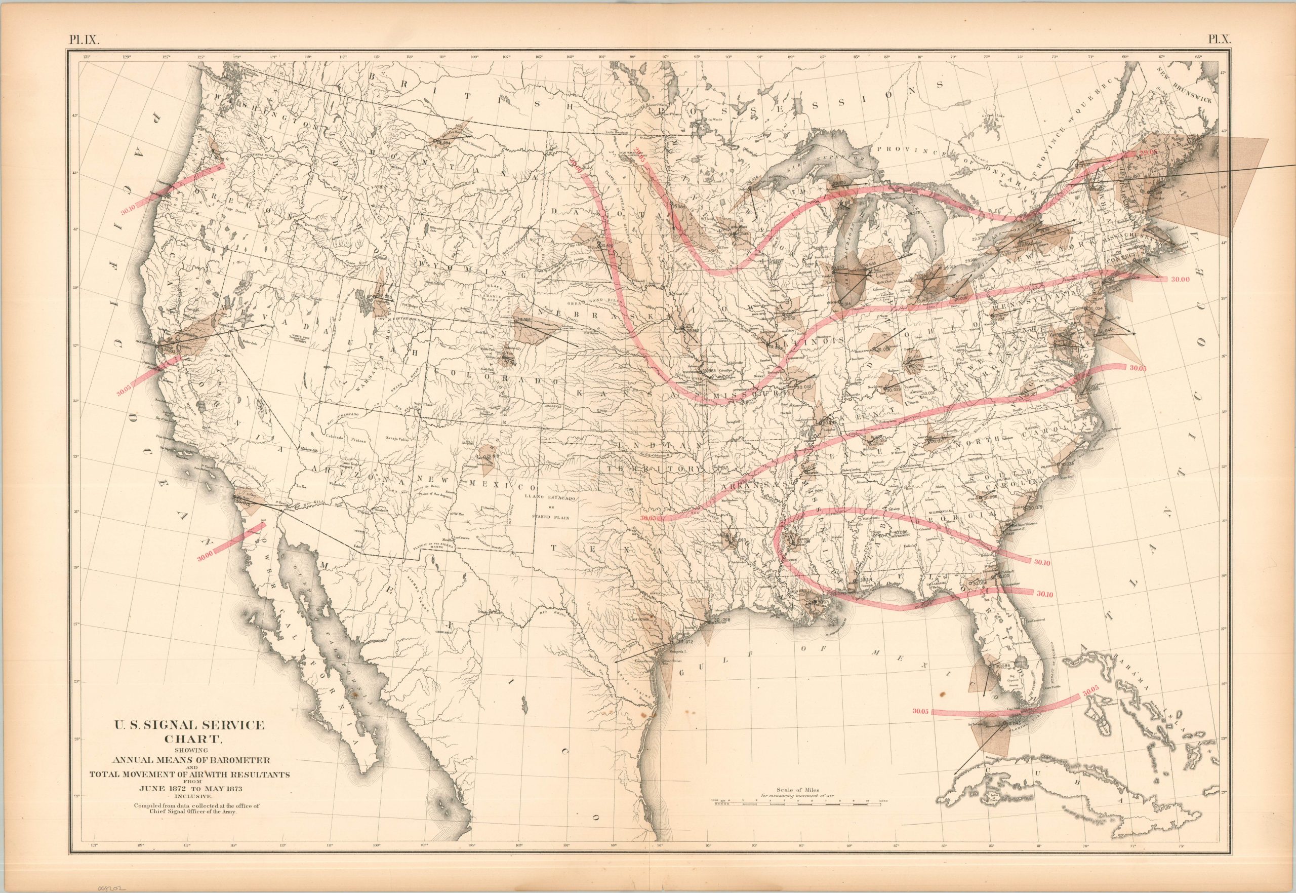
Compiled by the precursor to the National Weather Service, this interesting map charts variations in air pressure and extreme wind movements across the United States. The mean barometric pressures are provided in red, whereas the large brown areas represent the strength and direction (vectors) of winds measured at different points. With the exception of the Gulf Coast, nearly all blow from west to east, reflecting the ‘Prevailing Westerlies.’ The sheet was originally issued as part of The Statistical Atlas of the United States Based on the Results of the Ninth Census, 1870, compiled by Census Superintendent Francis A. Walker. Lithographed by Julius Bien and published in 1874. The atlas serves as the ultimate 19th-century “data portrait” of a reunified nation, meticulously synthesizing geography, climate, and demographics into a visual manifesto of America’s industrial and economic potential.